Global Design System
One of the first projects I took on at Ticketmaster was a component library to go along with a company rebranding, and site-wide re-platforming to React.
Many Attempts, but No success
Before I joined the company, designers had made a few attempts at creating a component library. Before I started this project, I wanted to understand what didn’t work before.
The challenges were clear: 30+ products across just as many siloed product and engineering teams, and there were at least 10 different front end frameworks (but at this point, the consumer side was consolidating some).
I knew the key was to find allies across the org—product and engineering— collaborating and communicating early and often so every team had a sense of ownership in the outcome.
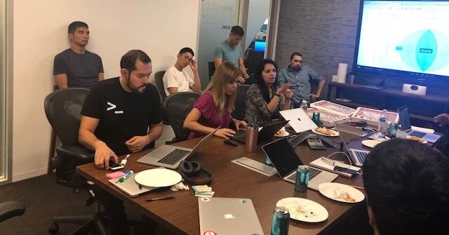
These allies had experience with component libraries, either at Ticketmaster or another company, and understood and supported the vision. In the beginning, I organized meetings with these allies to get the juices flowing and get siloed teams talking to each other. It wasn’t too long before they were setting up recurring meetings on their own and keeping the work going.
I learned quickly there was still resistance from some teams. But in those cases I stayed focused on the wins. And if any of these teams hit a snag related to UI inconsistencies, or long dev timelines, I shared how using the component library might help. It was probably annoying, but effective.
The Process
I laid out the business value for having a shared system, presented it to engineering and product executives, and got approval through a surge funding request.
In addition to being the Creative Director for the component library, I helped define the architecture of the system. Before I created the diagram below and shared it with cross-functional leads, there was a lot of confusion around how these components were going to be used and shared between teams. This diagram made it clear to everyone that a core set of components were truly global; others would have slight variations between consumer and enterprise uses; some UI elements are unique to each side of the business, but re-used often; and some are truly custom—not a part of the component library.
As the Creative Director on this project, I collaborated with 2 other designers from the Enterprise side, and 2 engineers to build the core global library.
In 2020, we began working with the International design team in London to create one truly global component library that would touch every product in every country where Ticketmaster has a presence.
event listing
On the consumer side, arguably the most important component to constantly iterate on, test and refine is the event listing. This is the bread and butter of our business.
Below is the original Event Listing from 2017 (and the 1990’s). The listing had a busy, muddled visual hierarchy, and looked dated. The font size and blue color also didn’t pass contemporary accessibility standards.
V1
In 2018, we briefly ran a design that stuck with the 2-column layout of the original, but made better use of white space, and moved all secondary information into an expandable area of the listing. This reduced the number of click areas to 2, along with simplifying the information and creating a single, more flexible, design.
V2
Users found the 2-column layout confusing, so we quickly pivoted to a cleaned up stacked version, which ran through 2020.
Both of these versions could support artist images to the left of the date.
Final version
In 2020/21, we’re launching what we think will be the most successful evolution. Early research has been promising. The different variations are designed to suit different event types and different contexts, showing only the information that’s most important. Instead of an expandable listing, more information about the event can be found in a modal, by clicking “Event Info.”
global design system and component library
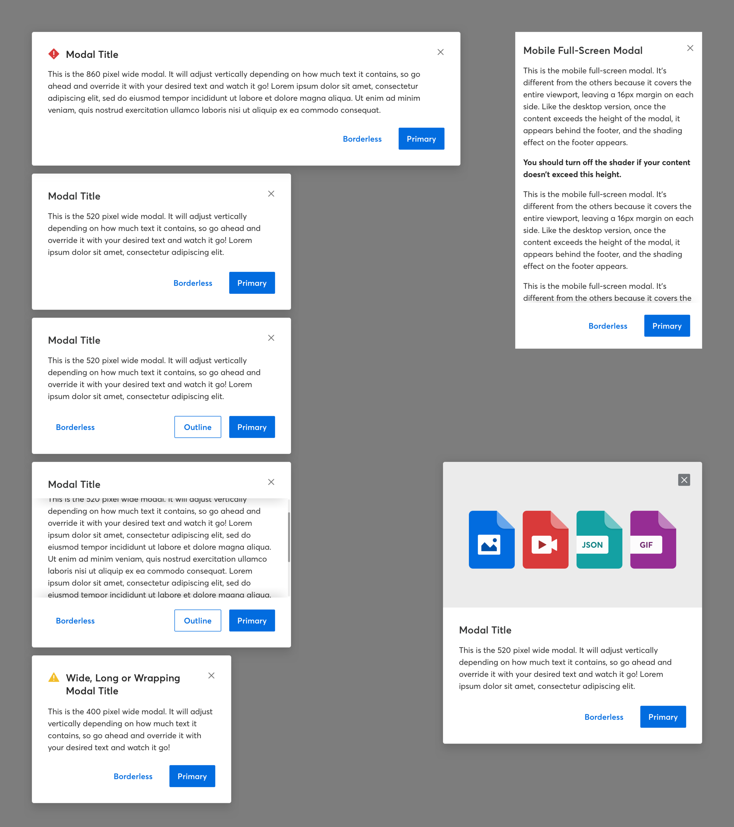
Select pieces from our global design system and component library. Among the many pieces I’m not showing: grid, spacing, search and more. See more at design.ticketmaster.com


