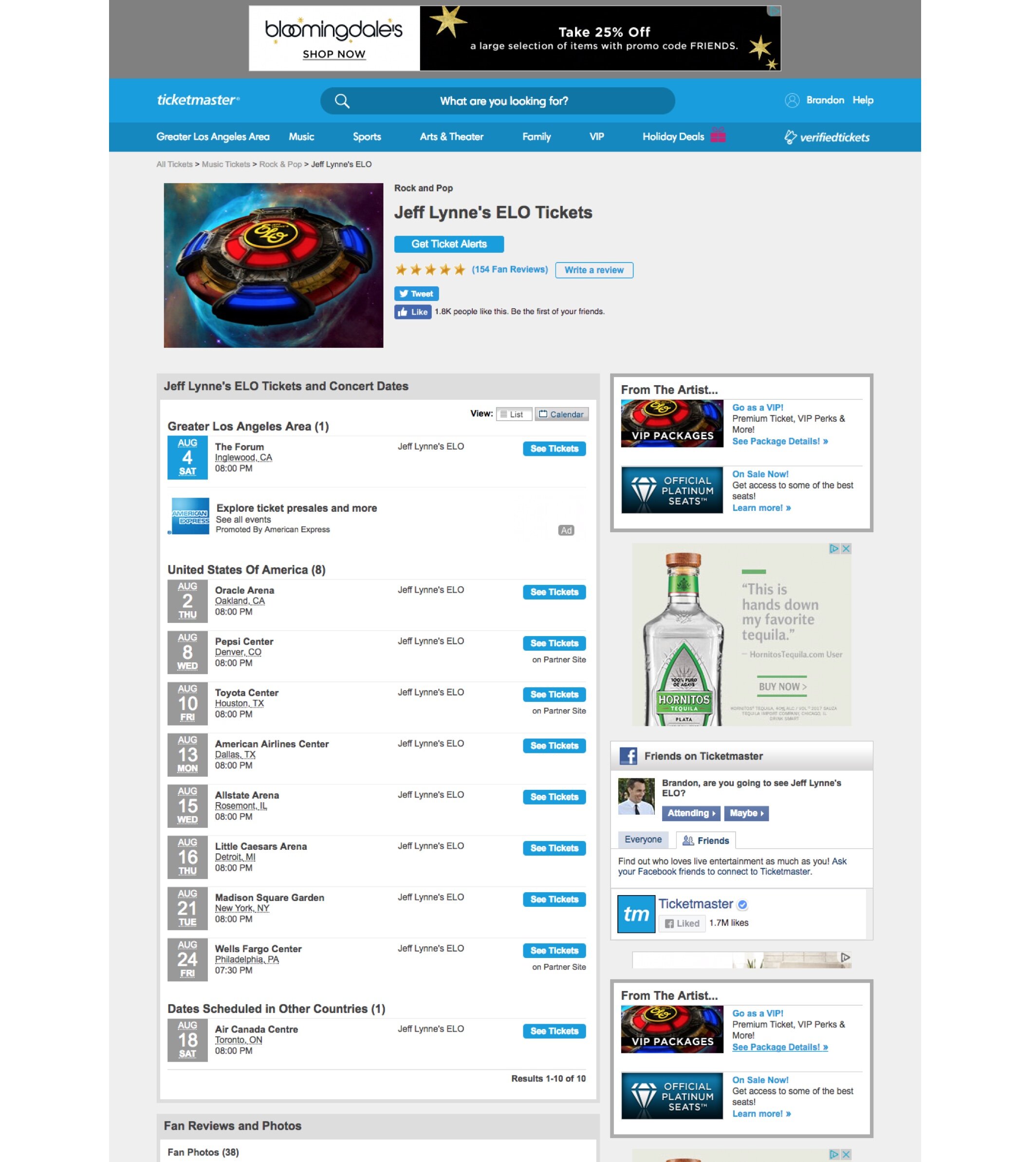
At Ticketmaster, I led the Fan Experience Design Team
I led a team of 15 hardworking and passionate designers who were responsible for all fan-facing products: Ticketmaster.com, the app, and Account Manager, our white-label season ticket platform.
Working together with our Product & Engineering partners, we increased NPS by +42pts over 2.5 years.
And Visioning became an important component for developing and pitching larger strategic initiatives
As I joined Ticketmaster, the products were beginning a foundational transformation.
The Problem
Until 2017, much of Ticketmaster.com hadn’t changed in nearly 20 years. The site listed events, but it couldn’t accommodate the unique needs of music fans, versus theater fans, versus sports fans. Research showed fans needed to discover sports, theater and music events differently — and they also expected Ticketmaster to have a Best in Class experience.
the process
Redesigning Ticketmaster has been a very slow, iterative process due to shifting business priorities.
So in order to set a North Star, I wanted the team to develop a point of view for where we want to take the experience. Every 6 months, I carved out time for my team to create a vision of a certain part of the experience. These were quick and dirty exercises that reinvigorated the team’s creative problem solving, and used research to generate and validate ideas.
It was important to do it every 6 months because our point of view evolved as we learned more through research and engagement data. But the core vision has remained the same. Ticketmaster can be fun, engaging, immersive and guiding — and celebrate live events in a unique way for different types of fans.
The intention of the Vision work was to visually express ideas—not design something that would ship. It was about inspiring ideas and sparking conversations.
patience & persistence
The winning recipe at Ticketmaster is patience and persistence. But we’ve celebrated the wins and we’ve continued to share our vision through our designs.
Ticketmaster home
The evolution of our home page involved setting a vision early on, then collaborating with Product and Engineering to incrementally move toward that vision. A lot of time has been spent negotiating with stakeholders on alternatives to rigid pre-existing requirements.
(1) 2021 vision (2) 2020 (3) 2017

Category page
With our current Category Page design, we focused on simplifying the page. But, similar to the home page, the 2020 page design is the result of designing around rigid ad and promoted content requirements.
(1) 2021 vision (top & bottom) (2) 2020 (3) 2017


Artist Page
Currently in development. Piece by piece, we’ve focused on reducing clutter caused by ads, a simplified event listing, and a bolder page header that can accommodate exciting full-bleed imagery.
(1) 2021 (2) 2020 (3) 2019 (4) 2017
My Account
Until 2017, navigating to My Account brought fans to a page where they can edit their account details. But how often do fans really need to do this? Not very often.
One of the first major updates I led was creating a new My Account Dashboard to show fans all of the most important activity and information in their account — their next upcoming event with helpful tips; ticket listing activity; profile details; plus a few recommendations to help them find their next event.
Ticket Resale
Like the rest of Ticketmaster, the page was functional and utilitarian. Our redesign gave fans a clearer visual hierarchy, guidance and access to customer support.
The changes were successful. Sell through rate of tickets increased by 13%, resulting in $40M GTV. And fans edited their listings half as much, meaning they were able to price their tickets more accurately from the beginning.
(1) 2020 listing page. (3) 2017 listing page.


